A well-crafted landing page is essential for any brand’s online success; it bridges potential customers and a business’ product or service, but which attributes describe a good landing page experience?
Whether an individual wants to be informed, entertained, persuaded, or convinced, they must have an enjoyable, easy to navigate website.
This article examines which attributes describe a good landing page experience by looking at usability, accessibility, and engagement.
Usability refers to how user-friendly a website is – whether information can be easily located, forms are simple to fill out, and navigation allows users to find their way around with little difficulty.
Accessibility looks at how easy it is for people of all abilities to access websites – from those who rely on screen readers to navigate content to visually impaired individuals.
Engagement considers how much interaction happens between the user and the site – does it offer helpful advice? Does it provide exciting content that keeps visitors coming back again and again?
Overall, a successful landing page should provide clear instructions and guidance throughout the entire process to empower users during their journey.
By understanding these three key elements – usability, accessibility, and engagement – businesses can create engaging experiences that leave lasting positive impressions in consumers’ minds.
Characteristics For An Optimal Landing Page
Creating an optimal landing page experience is essential for online businesses to gain customers, generate leads and increase sales.
A successful website must have a few key characteristics that will help create an enjoyable user experience.
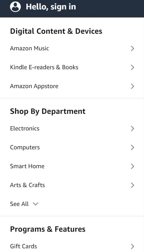
The first characteristic of a good landing page is easy navigation. Users should be able to quickly find what they are looking for with minimal clicks or effort.
Essential navigational items, such as the main menu, should always be accessible at the top of each page. Any submenus should be visible to ensure users can get where they need without hindrance.
Original content plays an essential role in creating an enjoyable user experience on a website’s landing page. Content should be well-written, relevant to the target audience, up-to-date, and accurate.
Additionally, websites must optimize their loading times, as slow load speeds can lead visitors away from the site before it even has a chance to prove itself valuable.
Finally, there must also be some sort of call-to-action present on the landing page, so users know what action they need to take next if they wish to proceed with whatever process your website offers them.
Whether this involves signing up for a newsletter, downloading something, or making payment for goods/services – make sure it’s clear!
Elements To Consider For A Quality Score
Creating a good landing page experience requires careful consideration of several elements.
Companies must ensure that the content on their landing pages is relevant to what the user is looking for and have an attractive design.
For example, Apple created its App Store Landing Page to make users easily browse hundreds of apps and find what they are searching for quickly and easily. By doing this, Apple increases its conversion rate significantly.
The quality score is essential in determining how successful a company’s landing page will be. A higher quality score means companies have more efficient web pages, resulting in a better customer experience.
The main factors influencing the quality score include content relevancy, loading speed, usability, navigation structure, and overall design.
A good landing page should also provide clear calls to action so that customers can quickly understand what action needs to be taken next. This helps create an intuitive user journey and encourages visitors to take desired steps during their visit.
Therefore, creating a high-quality website is essential for businesses looking to maximize conversions from their online platforms.

It is necessary to pay close attention to all design aspects when developing effective landing pages, as these can directly impact whether or not customers stay on your site and convert into paying customers.
Through continuous testing and optimization, companies can guarantee the best possible performance from their websites by providing users with positive experiences every time they land on them.
What Potential Visitors Seek From Your Site
Creating a good landing page experience is essential for any business. Visitors will often come to your site with a subconscious desire for freedom, and it’s important that the page accurately reflects their needs.
Here are some key elements potential visitors seek from your website:
- Relevant and Original Content – Potential visitors want content relevant to them and original in its presentation. Content should be interesting and engaging enough to keep readers on the page.
- A Call To Action – Provide clear calls-to-action throughout the page so users can quickly find what they need without having to search through pages of text. This helps create an inviting atmosphere where people feel comfortable taking action.
- High-Quality Visuals – The visual appearance of your landing page must be high quality if you want to create a good user experience. Ensure images are crisp, clear, and adequately sized; colors are vibrant; and fonts are legible.
All these elements help create a good landing page experience for potential customers, giving them access to the information they need quickly and intuitively.
By creating pages that offer an enjoyable browsing experience, businesses can ensure more conversions from those visiting their sites.
How Can You Make Sure Your Landing Page Is User-Friendly?
Creating a useful and user-friendly landing page is essential for any website that wishes to acquire high user traffic.
Landing pages provide visitors with the information they’re looking for and present them with options for exploring your site further.
Therefore, you must ensure your landing page has all the necessary elements to ensure a good experience for potential website users.
The first element of creating a successful landing page is providing clear and concise personal information about what the visitor will find on your site.
This should include links to other areas of interest, such as products or services offered by your business.
A well-designed landing page also includes images or videos that can help draw attention to key content and give visitors a more detailed overview of what they can expect from their visit.
Ensuring clarity and focus in this area makes it easier for people to engage with your site quickly and efficiently.
To maximize its effectiveness, it is also vital that you design navigation menus that are intuitively laid out so visitors can quickly move through the different sections without having to spend time trying to figure out where they need to go next.
Interactive features such as hover effects or drop-down menus should be included, but try not to overcomplicate things; otherwise, people may become overwhelmed at navigating the page.
Additionally, adding social media buttons allows users to share content from your website with others – ultimately increasing engagement levels even further.
By considering these factors when designing a landing page, you can create an engaging experience for potential website visitors, encouraging them to explore your site more deeply, leading to higher conversions or sales overall.
What Makes A Good Landing Page Design?
Landing pages are an integral part of a successful online marketing strategy.
Whether you’re selling products and services or promoting content, ensuring that your landing page is well-designed and easy for visitors to use is essential.
Discover what attributes make up a good landing page experience so you can create one that captures leads effectively.
The following table outlines key features which make up the perfect landing page design:
| Attributes | Benefits | Examples |
| Transparent about the client’s business | Visitors don’t need to search for information; they get it immediately from the homepage. | The page’s detailed “about us” section clearly explains the company’s mission/vision. |
| Easy navigation & intuitive user interface | Facilitates smooth user journey & reduces bounce rate. | Clearly labeled tabs at the top of the page lead users to different sections. |
| Engaging content & visuals (images/videos) | Reinforces message & helps keep the visitor engaged until the conversion point is reached. | Addresses pain points in a relatable way through story-telling imagery. |
| Visible CTAs & relevant offers | Encourages action while providing an incentive to convert quickly. | A clear call-to-action button is placed prominently on the page with targeted offers like discounts or webinars. |
| Accessibility across devices & browsers | Ensures all visitors have access regardless of the device used. | Responsive design optimizes the viewing experience across desktop, tablet, and mobile platforms. |
All elements must be included together to optimize your chances of success.
Ensure your landing page is transparent about the client’s business, has easy navigation and intuitive UI, engaging content and visuals with visible CTA’s, and is accessible across multiple devices and browsers.
If these factors are considered during the creation process, you can maximize conversions and produce effective results!
Benefits Of Creating A Relevant Content-Rich Experience
Creating a relevant content-rich experience is important for successful landing page design.
Quality content that resonates with the target audience will help build trust in the brand and create a positive overall experience for visitors. Users should easily find contact information such as phone numbers, email addresses, etc.
The right design features can also improve user engagement by providing visual cues to encourage them to interact more deeply with the website.
When creating quality content, it’s essential to understand who your target audience is and what they are looking for when visiting your site.
Content should be tailored towards this audience, featuring topics and keywords they want to read about or search for online.
Relevant images, videos, and infographics can also add value to the page while helping to keep people engaged on the landing page longer.
Content should not only focus on selling products but also provide valuable information that helps solve problems and educates readers about various topics related to the product or service offered.
This type of valuable content gives visitors something worth coming back for, improving their overall experience and increasing sales conversions over time.
Tips For Optimizing Your Landing Page To Convert Visitors
Creating an optimal landing page experience is essential for maximizing conversions. For starters, it should be mobile responsive so visitors can easily access it from any device they use.
Additionally, the content on the page should be clear and concise – no fluff or filler words! The desired action of the page should also be immediately apparent to your visitor; a strong value proposition will help motivate them to take this action.
Loading time is another critical factor: if your page takes too long to load, you risk losing your customer’s attention.
Creating visually appealing pages with engaging visuals such as images and videos is vital.
Adding compelling headlines and subtitles helps grab user attention quickly and encourages people to read further. Ensure you concisely highlight all benefits without overwhelming users with too much text.
Finally, providing trust signals like customer reviews or security badges will help build credibility and encourage more visitors to convert into customers.
To maximize conversions, ensure that the elements of your landing page fit together seamlessly and minimize distractions by removing unnecessary links or buttons that could lead away from your primary purpose.
Keep in mind these tips when optimizing your landing pages for maximum success!
Ways To Increase Transparency For A Positive User Experience
Creating a positive user experience on any landing page starts with transparency.
In today’s fast-paced digital marketplace, potential customers want to know precisely what they get when buying a product or service.
The business owner must provide transparent information about their offer to ensure users feel secure and confident in their decision.
This means giving detailed descriptions of products or services and contact info such as phone numbers and email addresses.
It’s also essential to provide reviews from other customers who have purchased similar items.
People love hearing stories of success and failure, so this can help give them an idea of what kind of results they should expect if they decide to purchase the item.
Additionally, businesses should be willing to answer customer questions quickly and thoroughly before making a purchase decision.
By doing so, companies will foster trust between themselves and their customers, which could result in increased sales conversions over time.
Having a transparent online presence allows for greater engagement with your target audience while creating additional growth opportunities.
Transparency builds credibility by showing potential customers that you take your reputation seriously; therefore, leaving no stone unturned is vital for long-term success.
Providing honest details about your product or service gives visitors all the facts needed to make informed decisions—and that’s how great experiences begin!
Strategies For Improving The Credibility Of Your Site
Your site’s credibility is essential for creating a positive experience on your landing page. Creating a design that meets their needs and expectations is necessary to ensure that users can trust the content they see.
The most effective way to do this is by ensuring that your pages are easily accessible through search engines and other sources. This will help visitors quickly find what they need without feeling overwhelmed or confused.
Additionally, having clear headings and concise descriptions helps make it easier for people to know exactly what each page contains before clicking on the website.
In addition to being visible in search engine results, having an intuitive navigation system also increases user confidence in your site.
By providing them with easy-to-follow paths from one area to another, you can reduce frustration levels and improve overall satisfaction with the experience of visiting your landing page.
Furthermore, incorporating helpful visuals such as charts and images can help break up long blocks of text, which makes the information easier to digest visually.
Finally, utilizing feedback tools like surveys gives customers a chance to voice their opinions about how well their visit went – giving you valuable insight into how to optimize future experiences even further.
By taking these steps towards ensuring that your landing page design offers users an enjoyable experience filled with credible information, you can increase customer loyalty while boosting conversion rates at the same time.
Providing Value Proposition To Boost Conversion Rate
A good landing page experience is like a well-crafted map; it helps guide visitors to find what they are looking for quickly and easily. The attributes that describe such an experience include clarity of purpose, visual appeal, and the ability to decide.
Clarity of purpose must be established early on in the visitor’s journey – this will significantly impact whether or not they stay long enough to convert. Visually appealing elements should also be present since people tend to respond better when visuals are involved.
Additionally, visitors need to know what they need to do next in order to move closer to conversion. Providing step-by-step instructions can help strengthen their confidence that completing the desired action is possible.
Website owners create an environment conducive to conversions through effective value proposition delivery.
This means helping visitors understand why making a purchase now makes more sense than waiting until later; doing so requires providing information about how their life would change after making the purchase.
When done right, delivering value propositions has been proven time and again as one of the most reliable strategies for boosting conversion rates across digital properties.
Making Sure The Website Loads Quickly And Efficiently
When working on your landing page, ensuring the website loads quickly and efficiently is essential.
This will ensure a smooth user experience for visitors, which can help boost the conversion rate. Many factors need to be considered when designing a good landing page. One of them is making sure that everything works correctly.
As such, they use cookies to store information about visitors, so they don’t have to re-enter specific data again during their visits.
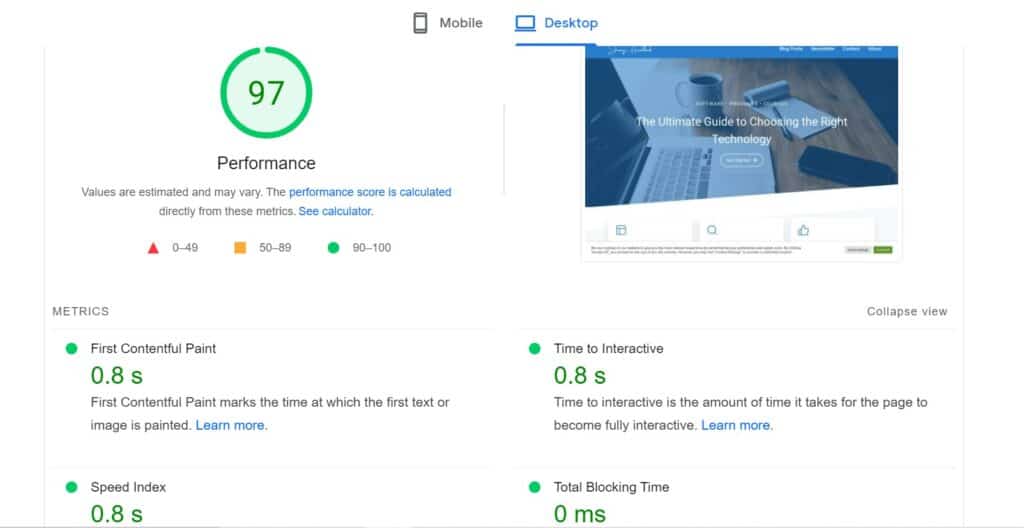
Additionally, you want to ensure images and videos load correctly without any lag or delay in the visitor’s journey through the site to be as seamless as possible.
Another factor is responsiveness; this means making sure the page looks good regardless of the device being used by the customer: desktop computer, laptop, tablet, or mobile phone.
Finally, optimizing loading times helps reduce bounce rates while also improving SEO rankings which can result in more organic traffic coming into your website from search engines like Google and Bing.
Therefore, ensuring quick loading times should not be neglected when designing a successful landing page.
Utilizing Call-To-Action (CTA) Buttons Effectively
A good landing page experience is essential for any website, and it starts with effectively utilizing call-to-action (CTA) buttons. You must learn which attributes describe a good landing page experience to hit the ground running.
Critical elements of successful CTA buttons include being clear, concise, relevant to your audience, visible on all devices, and approachable from multiple angles.
The key to driving conversions is understanding how visitors interact with the site, enabling effective communication between them and the user interface. Integrating visuals into your design, such as arrows or indicators that draw attention to the button, can significantly increase conversion rates.
Additionally, using language that resonates with users helps create an inviting atmosphere where they are more likely to take action.
When crafting CTAs, it’s essential to think strategically about what actions you want customers to take upon visiting the page. If done right, they will be inspired by their own free will leading them directly down a path of success.

It’s up to us marketers to ensure our designs give customers something tangible in return – whether that means rewards points or exclusive discounts — so they feel empowered making those decisions themselves.
Mobile Responsiveness And Its Impact On Visitor Engagement
The quality score and spending of your ad budget on a landing page is one factors that can have an impact on visitor engagement. When visitors land on your page, they expect to experience something engaging and user-friendly.
If the website design is not mobile responsive or has too much clutter, it may cause visitors to leave quickly without making any conversions. Quality landing pages should be designed with mobile responsiveness so that users can access information easily from their phones or tablets.
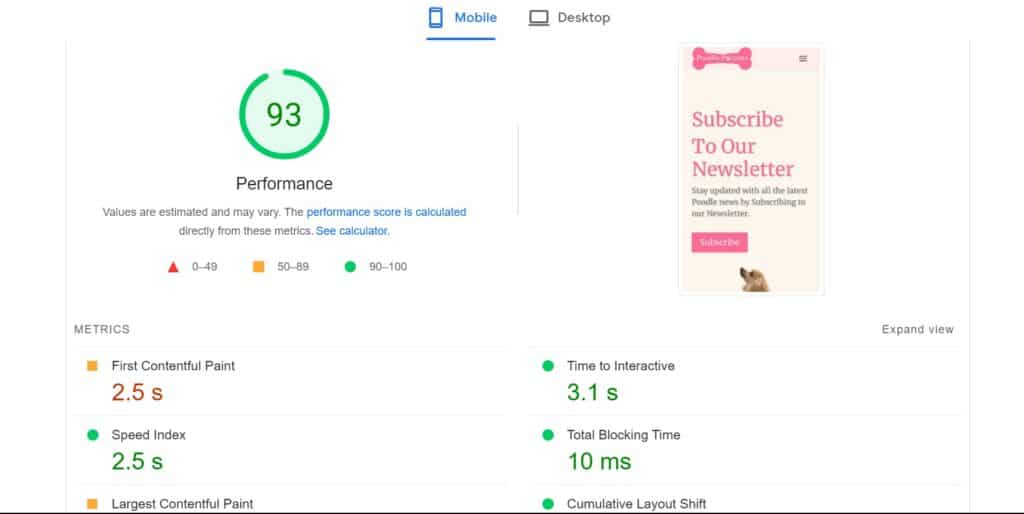
Furthermore, when creating a good landing page experience for visitors, it’s essential to consider how well-optimized the content is for different devices.
This means ensuring images are appropriately sized for desktop, tablet, and mobile screens and adjusting font sizes accordingly.
Additionally, ensure all clickable elements are spaced out enough so that users don’t accidentally tap the wrong thing while navigating through the content.
By considering key elements such as these during the design process, you can create a more enjoyable experience for visitors regardless of which device they’re using to view your page – ultimately leading to better customer retention rates and higher conversion levels.
Factors That Contribute To An Overall Successful Landing Page
Creating a successful landing page is like painting a beautiful landscape; the key is to capture the viewer’s attention and direct it toward your desired goal.
To achieve this, several factors must be taken into account:
- Clear Layout: A well-structured layout ensures visitors can easily find what they’re looking for and navigate through the page quickly.
- Compelling Visuals: The use of compelling visuals helps to draw our audience’s attention and keep them engaged. This could include images, videos, or animations.
- Concise Messaging: Keep your message clear and concise to not overwhelm visitors with too much information at once.
- Captivating Headline: Your headline should immediately grab the viewer’s attention by summarizing what you want them to do within seconds.
- User-Friendly Navigation: Ensure all navigational elements are easily located on the page to ensure a positive user experience.
These five attributes harmonize harmoniously to create an effective landing page that will engage potential customers and leads them to action. By optimizing each element effectively, businesses can significantly enhance their overall conversion rate!
Conclusion
In conclusion, a successful landing page should be well-designed to enable potential visitors to find the content they seek. This is done by focusing on sound design and ensuring the website loads quickly and efficiently.
Additionally, mobile responsiveness needs to be considered for visitor engagement rates to remain high. Furthermore, calls-to-action buttons should be used effectively so users can easily navigate the landing page and access information.
These attributes combined will result in an overall successful landing page experience as symbolized by a ship sailing over open waters – gliding smoothly towards its destination without any turbulence or difficulty. Achieving this level of success involves ensuring all of the critical factors discussed here are implemented correctly.
Thank you for reading: Which Attributes Describe A Good Landing Page Experience? If you have any comments, please send them below.
Frequently Asked Questions
1. What does a good landing page experience entail?
A good landing page experience refers to the overall user experience when visiting a specific webpage designed to capture visitors’ attention and convert them into potential customers. It takes into account various attributes, which we will explore further.
2. How would you describe a good landing page?
A good landing page engages the user and encourages them to take the desired action, such as purchasing, subscribing to a service, or filling out a form. It should have a clean, professional design, be easy to navigate, and provide relevant and original content.
3. What are some key attributes that describe a good landing page?
Some key attributes that describe a good landing page include:
- Easy to Navigate: The landing page should have clear and intuitive navigation, making it easy for visitors to find the information or product they seek.
- Relevant and Original Content: The content on the landing page should be unique, informative, and directly related to the product or service being offered.
- Transparent About the Client’s Business: The landing page should communicate who the business is, what they offer, and why the visitor should choose them over competitors.
- Clear Call-to-Action (CTA): The landing page should have a prominent and easily identifiable CTA that clearly instructs the visitor on the action they should take next.
- Conversion Optimization: The landing page should be optimized to increase conversion rates, with carefully placed buttons, forms, or other elements that guide the user towards the desired action.
- High-Quality User Experience: The landing page should provide a seamless and enjoyable experience for the user, with fast load times, visually appealing design, and easy-to-read content.
4. How can a good landing page experience positively impact conversion rates?
A good landing page experience can have a significant positive impact on conversion rates. A well-designed and optimised landing page effectively communicates a product’s or service’s value proposition, builds trust with the visitor, and guides them towards taking the desired action. This can result in higher conversion rates and ultimately lead to more customers or leads for the business.
5. Why is transparency an important attribute of a good landing page?
Transparency is an important attribute of a good landing page because it helps build trust with the visitor.
A well-crafted landing page is essential for any brand’s online success; it bridges potential customers and a business’ product or service.
Whether an individual wants to be informed, entertained, persuaded, or convinced, they must have an enjoyable, easy-to-navigate website.
This article examines what attributes make up a good landing page experience by looking at usability, accessibility, and engagement.
Usability refers to how user-friendly a website is – whether information can be easily located, forms are simple to fill out, and navigation allows users to find their way around with little difficulty.
Accessibility looks at how easy it is for people of all abilities to access websites – from those who rely on screen readers to navigate content to visually impaired individuals.
Engagement considers how much interaction happens between the user and the site – does it offer helpful advice? Does it provide exciting content that keeps visitors coming back again and again?
Overall, a successful landing page should provide clear instructions and guidance throughout the entire process to empower users during their journey.
By understanding these three key elements – usability, accessibility, and engagement – businesses can create engaging experiences that leave lasting positive impressions in consumers’ minds.
